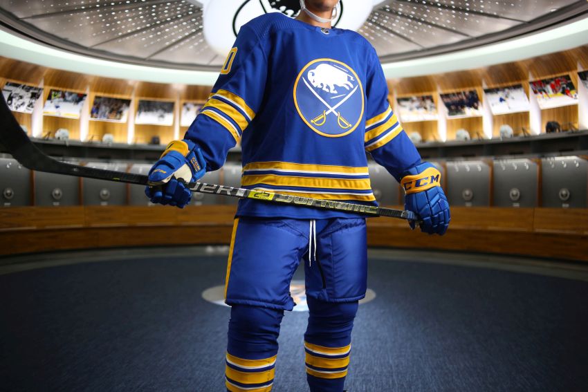
For the nostalgic Buffalo Sabres fan who has been longing for the team to return to its royal blue roots, the day has finally arrived.
The new uniforms the Sabres unveiled this morning strongly resemble the classic blue and gold motif but also boast several new design elements.
Designers removed silver from the crest, the charging buffalo with the crossed swords, “to create a slick modern appeal,” according to the team. The stitching pattern utilized in the team’s popular 50th anniversary jersey has also been carried over.
On the arms and at the bottom, white piping has also been added to the gold stripes.
The inner collar features a bolt of energy and a star, a nod to Buffalo and the city’s crest.
“The inner neck collar is our way of paying homage to our hometown,” the team said in a release.
For years, fans have been clamoring for the Sabres to return to their original color. The Sabres announced last summer they would be returning to royal blue following their 50th anniversary season.
Lovin’ the new look 😍
See more photos: https://t.co/8NSC5AfGRe pic.twitter.com/6Lcu49IESh
— Buffalo Sabres (@BuffaloSabres) August 11, 2020
This is the fifth major uniform change in franchise history. The Sabres wore their original jerseys from their inception in 1970 until 1996, when they switched to black and red uniforms that featured a logo that is commonly referred to as “the goat head.”
The team switched to navy blue and gold with a logo fans dubbed “the slug” in 2006. After introducing a navy third jersey with the buffalo and crossed swords logo in 2008, the team added a white version in 2010 and ditched the unpopular “slug.”
When Adidas began designing and manufacturing NHL jerseys in 2017, the Sabres removed gray from their uniforms, creating a sleeker look.
The new jerseys can be ordered here.


Wins not jersey changes is all I care about get your house in order Pegula
you are totally correct.